

29 March 2011


25 March 2011
That's Silly, Baggage Claim!

April's Highlight's High Five features one of my That's Silly! illustrations. Be sure to pick up a copy for the little ones in your life (or you can pick one up for yourself, I won't tell).
Below is somewhat of a step by step on how I went about making this piece. I say somewhat because there were steps I forgot to take screenshots of. Maybe I shouldn't be giving out my secrets, huh? I may be putting myself out of work.
Below is the hand drawn line art. I use a 05 micron with some touch up done with a 03. I find it gives good clean line weight.
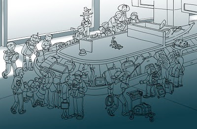


Flat colors are added via Photoshop. I knew I would be drawing the stuff outside the windows with my tablet so there was no need to ink it.


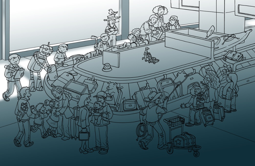


This piece took about 8 hours to sketch, 2-3 hours to ink, and 10 hours to color. This was a quick rush job so I am happy it came out as nice as it did. Whew!
17 March 2011
Highlights What's Wrong? of the Year 2010!

I just received the Highlights Silver Plate Award for the What's Wrong? illustration of the Year (2010)! The award was given to me for the above back cover illustration that was featured on the July 2010 issue. Thanks to the Highlights staff for all of your support and encouragement. It is wonderful to work with folks who really appreciate the extra effort you put into your work. I am honored and grateful.
More info about this piece can be found here.
Subscribe to:
Posts (Atom)