Showing posts with label that's silly. Show all posts

17 July 2014

That's Silly, Beach Lake!

... and some Heidi and Zeke hidden pictures.

My latest That's Silly! illustration is in this July's Highlights High Five issue. I took inspiration from many childhood summers spent at Pennsylvania's Promised Land Lake and some more recent memories of Rickett's Glen Sate Park (seriously the most beautiful park in PA).


The Heidi and Zeke hidden pictures are from July's Highlights Eagle Eye Hidden Picture magazine. Unlike regular hidden pictures, short stories accompany the illustration. In the first one Heidi and Zeke help a troubled young girl find her bunny rabbit before her family goes on a long car trip. Second, Heidi and Zeke help the Zamboni operator find his lost keys so he can clean the ice for the kids to get back to skating. 12-14 other objects are also hidden in each of these illustrations but I did them so long ago that I can't remember where they are. Wink!


25 March 2013

That's Silly, Bumper Cars!

This piece was recently published in Highlights High Five. I had a lot of fun doing extensive research on retro bumper cars. I found that the modern ones were just plain ugly.

Make sure to get a Highlights subscription for the little ones in your life. They now have magazines for everyone from ages 2-12.

14 December 2012

IF: Snow


It has been a long time since I submitted anything to Illustration Friday so I thought I'd post these three Highlights illustrations for the snow theme this week. Have fun finding all of the Silly/Wrong things!


02 April 2012

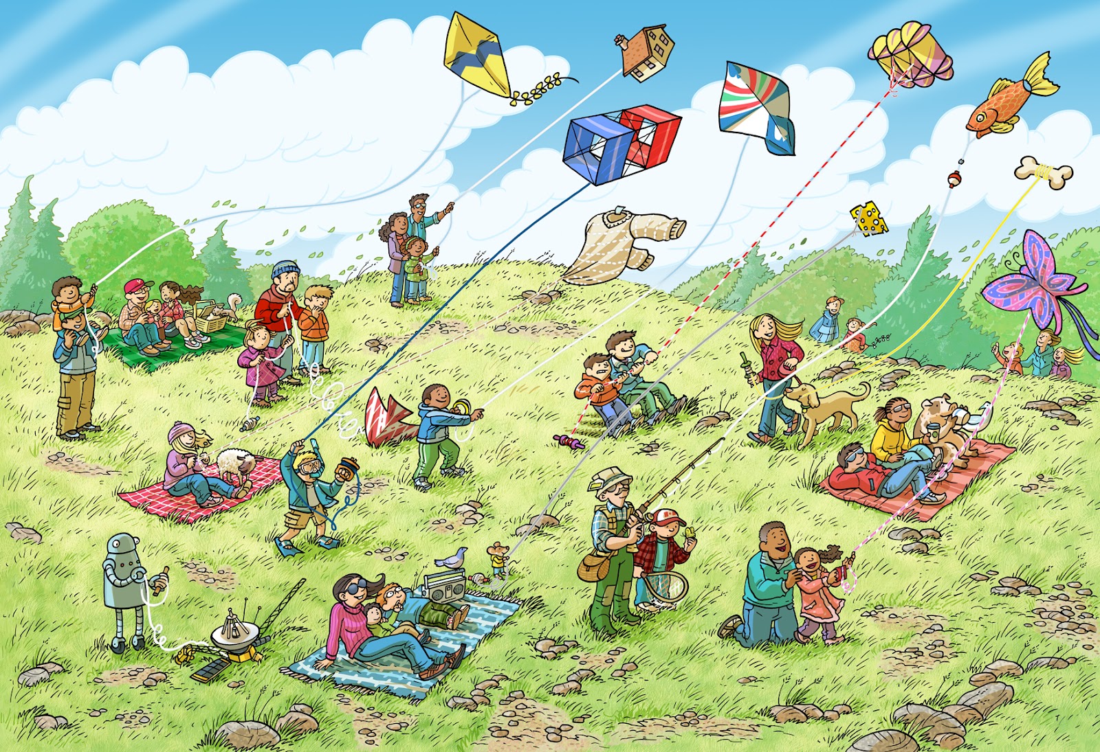
Those Silly Kites!


Who doesn't like to fly a kite? God knows I do. I own five and I always have them in the trunk of my car just in case the opportunity presents itself to fly. Keeping this in mind, you can understand why I over did it on the first draft of this That's Silly! illustration for Highlights High Five. I really wanted the perspective to be through the kites, as if you were up in the sky looking down on the people but it became too busy (especially for children under five years of age). In the first revision I tried holding on to some of that flavor but it was still too busy. Sadly even the New England town in the background had to be eliminated. What we ended up with, of course, is the final art above.

Some hidden tip of the hats: A Charlie Brown kite, Amir and Hassan's kite from the film The Kite Runner,  Voyager I and Drew Phillips of Ultimate Extreme Kite Flying. My father and I are flying the fish kite.


01 February 2012

That Silly City Park!


I'll be quick since I'm quite busy and sick. February's Highlights High Five features one of my That's Silly illustrations (as well as my monthly work in the craft/cooking spread). Yay! My wife, daughter and myself can be seen walking below the center tree dressed in our usual cowhand gear. 

Interesting note: In the published art the parent and child crashing into the hedges at the bottom of the hill was removed.

01 December 2011

Sneak Peek!


Here are two sneakity peekities at some upcoming illustrations I did for those wonderful folks at Highlights. The top one is for High Five and the bottom is for Highlights. Both will be available in April, 2012. Can you guess what satellite is pictured above? Keep in mind that the solar panel on the left was added to make it look more "visually acceptable." Hint: It is the most distant man made object from earth at 8.7 billion miles.

Below are some cute bunnies. The chocolate bunny snuggling up to the guy made this illustration for me. It was actually one of those happy accidents while I was drawing it.


29 August 2011

That's Sneaky!


Please forgive my lack of post, I have been plenty busy with some fun stuff for Highlights. Here's a little peak from an upcoming That's Silly! to be featured in Highlights High Five's February issue. 

12 June 2011

That Silly Parade!


Drawing a marching band is not easy. So much research was involved in making this as believable as possible, from the individual instruments to how to correctly hold them. I've really only ever played some guitar so my wife's knowledge of these instruments was invaluable to me. This piece is currently in the July 2011 issue of Highlights High Five which is available now.

I put a lot of cameos of family and friends in this one. The band is loosely based on my wife's high school, North Penn and their Marching Knights, of which she was a member. My wife can be seen playing the clarinet with holly attached to her hat. My Grandfather (of whom I am named after) can be seen on the left with my Grandma Vi. The four children sitting on the curb (one has a horn) are of myself (I'm wearing the Canada cap), my two brothers and my sister. We would often go to parades that were just up the road from us on Frankford Avenue in the Mayfair section of Philadelphia. Some of my nieces and nephews are pictured as well as a couple of friends with their kids. 

Here is the line art:


25 March 2011

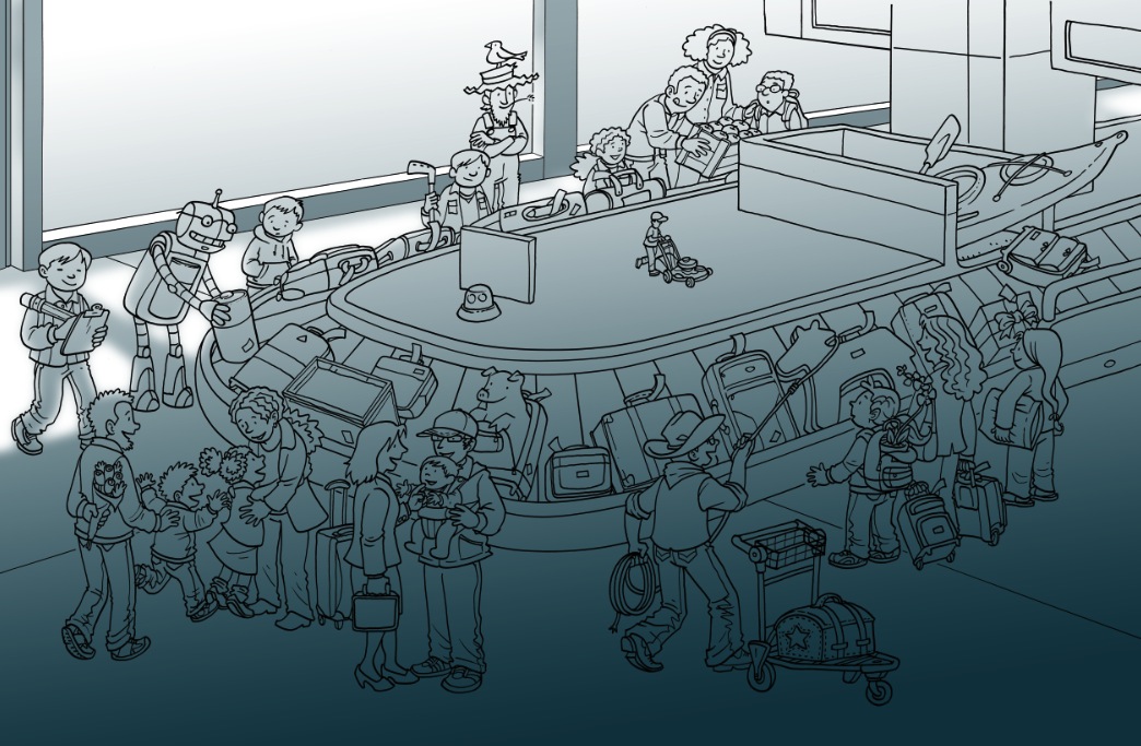
That's Silly, Baggage Claim!


April's Highlight's High Five features one of my That's Silly! illustrations. Be sure to pick up a copy for the little ones in your life (or you can pick one up for yourself, I won't tell).

Below is somewhat of a step by step on how I went about making this piece. I say somewhat because there were steps I forgot to take screenshots of. Maybe I shouldn't be giving out my secrets, huh? I may be putting myself out of work.

Below is the hand drawn line art. I use a 05 micron with some touch up done with a 03. I find it gives good clean line weight.


Flat colors are added via Photoshop. I knew I would be drawing the stuff outside the windows with my tablet so there was no need to ink it.


I turn off the colors layer and add a gradient layer knocking out the light with my tablet.


Finished shadows and some of the outside started.


Flat colors and shadows combined as well as some more details and changes.


I added more depth with the shadows under the feet of the characters at the request of the art director.


Finally the finished piece below. The shadows were pulled back about 65% (one of the benefits of working with layers) to print correctly on the Highlights paper.


This piece took about 8 hours to sketch, 2-3 hours to ink, and 10 hours to color. This was a quick rush job so I am happy it came out as nice as it did. Whew!

20 January 2011

Research. Research. Research.


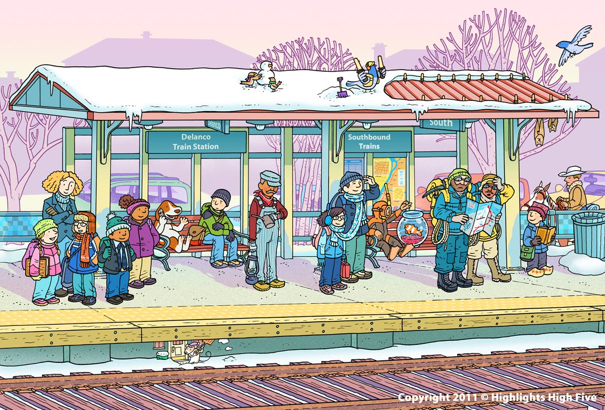
Here are some of the photos I took at the Delanco and Riverside train stations for my research for the last That's Silly! I posted here on the blog. Like most illustrators I try to find research online but in this case I just couldn't find what I was looking for so I took a little drive and took some photos. Although I didn't this time around, I also find it very helpful to make some quick sketches while on location. Even with digital photography there are just some details you're going to miss without studying through sketching.

Research is so important. I can't emphasize this enough to my students. It can make any illustration 100% more believable then if you're just making it up.

Look back at the illustration on the last post and you can see where the ideas came from.


The tile pattern.


The bench's iron work.


The map.

14 January 2011

That's Silly, Train Station!


Delanco, New Jersey's Riveline train station stars in February's Highlights High Five's That's Silly! (now available on your local magazine rack)
Delanco is a small all American town that sits on a peninsula surrounded by the Delaware River and the Rancocas Creek. I lived on the second floor of a remodeled old general store dating back to 1852 for 8 years. It was the first I was truly on my own. The train station was just three blocks away which would take me into Camden, NJ for my connection to the Patco line into Philadelphia. I love Delanco and I miss it quite a bit. It really is a great place to live. A lot of the suburban illustrations I make get their inspiration from my short time in Delanco.

I knew this scene was going to be published in February so I wanted to give it the feel of a cold snowy morning with the sun just rising. The funny part is that when I started working on this piece it was in the middle of August at 101 degrees.

Also, I am illustrator for the Make it! Cook it! spread each month in High Five (along with the talented Liz Dubois who illustrates the Cook It! Ingredients). I'll post some shots of the recent spreads soon.

For those who don't know, Highlights High Five is a magazine aimed at children 5 and under. Get a subscription today!

04 October 2010

That Silly Highlights Building!


Back in July I was asked to create the above mural for the Highlights Illustrators' Party. A big honor. The theme was based on Highlights High Five's "That's Silly!" feature, a variation of the Highlights' "What's Wrong?" feature that is found on the back covers of which I have been doing a lot of the past year.

Since blogger will not allow you to get a closer look at this image I have split and uploaded the mural as close up segments below. A detailed description of how I went about making this piece is below the last segment.


A lot of people have asked me how I did this piece so I will do my best to explain this process without boring you with too many details.

Right away we knew we wanted the Highlights building to be the central feature of the piece so I started on some loose sketches using photos I had taken myself and some that I had found on Google Maps' street view. I also did some brainstorming by writing down some silly ideas.


Once I had a rough sketch of the scene chosen I enlarged it and made these rough sketches on top to flesh out the ideas for the silly situations (some I made up and some were suggested by the staff of Highlights). All four season were to be represented in the illustration which was hard to pull off. Winter and fall were easily recognizable but how does one differentiate between summer and spring?


Once I had some ideas down I did more research and sketched out the building with the characters to be added later. I always consider the background just as important as the characters so I take the extra time to make sure it has enough character to stand on its own. I also didn't use any vanishing points since using them often makes the drawing stale and kind of phony looking. I just eyed it up as best as I could. All of this was done by hand on a 24" wide piece of paper.


As you can see above I only drew 2 windows and a few of the small pillars but after it was scanned I duplicated them and carefully put them in position using Photoshop's distort transformation tools. I also separately sketched some elements to the right and left of the building to fill the 40" width as seen below. I had to keep in mind that when printed it would be 13 x 40 feet so I worked with the ratio of 1 inch = 1 foot. Some of the drawing was also done using my wacom tablet.


After the building was completely sketched, I tile printed it and taped it together. Now it was time to add the characters. I placed two sheets of 24" layout on top and went to work. It went form one side of my art table to the other.


After the characters were finished I scanned them in and used Photoshop to place them in the scene. I think there were some 40 layers at 175 MB before I flattened it.


At this point the file was sent to the Highlights' Art Director, Cindy. A week or so later corrections were sent so I quickly revised the sketch as seen below. A big benefit to having all of your characters on separate layers is that if something needs to move, be removed, or replaced it is fairly easy to do. The windsurfer was removed and replaced with the cabin among other things.


Now it was time for inking. Usually I ink all of my work by hand and scan it in but once I started I realized that all of my small details were getting entirely too fudgy. Since this piece was going to be enlarged I knew that all of the flaws in my inking would be magnified so I decided to ink with my wacom tablet in Photoshop using the brush tool. That way I could get up close and personal with the line and really have control over the small minute details (click on the 100% view below). I'm not a big fan of the artificial smoothness of the pen tool so I stuck with the brush tool. Thanks to the suggestion of a few illustrators I inked at a higher than normal resolution of 600dpi.


It definitely took some getting used too and I really damaged my hand inking it over the next few days (a price I'm still paying for). Once done the entire piece was inked in one 13x40" file. I inked only two windows, one small pillar, and duplicated them here as well.


After the inking was completed I reduced the file to the standard 300dpi resolution and got to work on the colors (click on the 100% view below). I start off with point-and-click paint bucket coloring first and move onto textures later. I have designed and/or downloaded some of brushes over the years to use for texturing.


A little over a week later I finished the coloring and sent it off to Cindy.

UPDATE: I forgot to thank my wife, Daisy, for pulling some single Mom duty to give me the time to finish the coloring. Toward the end there, I was working 18 hour days in order to have this done on time.


That same day it was sent off to the printer and enlarged into this billboard sized mural. After being delivered those brilliantly handy guys at Highlights built a frame so it could be to be placed in the local firehall for the party. Here is a photo of it before the party.


Tim was nice enough to let us see it before the party so I could get a few photos with my family. I can't put into words how cool it was to see my art so large.


It really was weird and wonderful to feel as though I was standing in my art work.


Thanks to everyone that made the decision to honor me with this crazy project. I hope I get to do something this fun again. Thank you, thank you, thank you.


All images are Copyright © Highlights for Children 2010.

22 July 2010

Coming Soon

Here are some previews from upcoming work I recently did for Highlights for Children and Highlights High Five. The first two are from High Five and should be available in the winter. The first preview is from a "That's Silly!" illustration and the second is part of a surprise that will be included inside the back cover. The rest are from back cover "What's Wrong?" illustrations for Highlights for Children.


The lost mountaineers above are none other than Sir Edmund Hillary and Sherpa Tenzing Norgay, the first men to climb Mount Everest on May 29,1953.


Pictured above is the dog I grew up with, Tootsie.


The horse in blue is America's favorite horse, Secretariat.