Showing posts with label what's wrong. Show all posts

16 October 2013

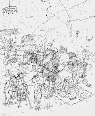
Sketches from the Stargazing What's Wrong? illustration.

Here are the sketches from my latest What's Wrong? illustration created for November's Highlights. 

As you can see the first one is a bit too crowded, there aren't enough average sized telescopes and there isn't enough sky showing.


The second is less crowded. The only problem is a few "wrongs" aren't obvious enough.


The "wrongs" are not a bit easier to read but more children are needed.


The final sketch.


16 November 2010

What's Wrong, Ice Sculpture?


This is my submission for IF: Winter.

This What's Wrong? piece was really fun to work on. It appears on the back of the December issue of Highlights for Children. Below is the finished line art. Roughly 16 inches wide. More details and secrets below...


Below is the sketch. Going into this I thought it as going to be really difficult but it all came together pretty easy. It wound up taking only 7-8 hours to sketch. You can see the major differences between the final art and the sketch here. Changes of note: Most of the sculptures are close to finish. The Texas shaped base of Ranger Kent. The guy with the chainsaw. The sea turtle the woman is standing on. The kid "stabbing" the fisherman in the back (not intentional). Also, Ranger Kent looks like he is sitting inside the horse, a major oversight on my part.


Below are the little "secrets" that I added. Again, I think it would go over most people's heads but it's fun for me to add them in.


04 October 2010

That Silly Highlights Building!


Back in July I was asked to create the above mural for the Highlights Illustrators' Party. A big honor. The theme was based on Highlights High Five's "That's Silly!" feature, a variation of the Highlights' "What's Wrong?" feature that is found on the back covers of which I have been doing a lot of the past year.

Since blogger will not allow you to get a closer look at this image I have split and uploaded the mural as close up segments below. A detailed description of how I went about making this piece is below the last segment.


A lot of people have asked me how I did this piece so I will do my best to explain this process without boring you with too many details.

Right away we knew we wanted the Highlights building to be the central feature of the piece so I started on some loose sketches using photos I had taken myself and some that I had found on Google Maps' street view. I also did some brainstorming by writing down some silly ideas.


Once I had a rough sketch of the scene chosen I enlarged it and made these rough sketches on top to flesh out the ideas for the silly situations (some I made up and some were suggested by the staff of Highlights). All four season were to be represented in the illustration which was hard to pull off. Winter and fall were easily recognizable but how does one differentiate between summer and spring?


Once I had some ideas down I did more research and sketched out the building with the characters to be added later. I always consider the background just as important as the characters so I take the extra time to make sure it has enough character to stand on its own. I also didn't use any vanishing points since using them often makes the drawing stale and kind of phony looking. I just eyed it up as best as I could. All of this was done by hand on a 24" wide piece of paper.


As you can see above I only drew 2 windows and a few of the small pillars but after it was scanned I duplicated them and carefully put them in position using Photoshop's distort transformation tools. I also separately sketched some elements to the right and left of the building to fill the 40" width as seen below. I had to keep in mind that when printed it would be 13 x 40 feet so I worked with the ratio of 1 inch = 1 foot. Some of the drawing was also done using my wacom tablet.


After the building was completely sketched, I tile printed it and taped it together. Now it was time to add the characters. I placed two sheets of 24" layout on top and went to work. It went form one side of my art table to the other.


After the characters were finished I scanned them in and used Photoshop to place them in the scene. I think there were some 40 layers at 175 MB before I flattened it.


At this point the file was sent to the Highlights' Art Director, Cindy. A week or so later corrections were sent so I quickly revised the sketch as seen below. A big benefit to having all of your characters on separate layers is that if something needs to move, be removed, or replaced it is fairly easy to do. The windsurfer was removed and replaced with the cabin among other things.


Now it was time for inking. Usually I ink all of my work by hand and scan it in but once I started I realized that all of my small details were getting entirely too fudgy. Since this piece was going to be enlarged I knew that all of the flaws in my inking would be magnified so I decided to ink with my wacom tablet in Photoshop using the brush tool. That way I could get up close and personal with the line and really have control over the small minute details (click on the 100% view below). I'm not a big fan of the artificial smoothness of the pen tool so I stuck with the brush tool. Thanks to the suggestion of a few illustrators I inked at a higher than normal resolution of 600dpi.


It definitely took some getting used too and I really damaged my hand inking it over the next few days (a price I'm still paying for). Once done the entire piece was inked in one 13x40" file. I inked only two windows, one small pillar, and duplicated them here as well.


After the inking was completed I reduced the file to the standard 300dpi resolution and got to work on the colors (click on the 100% view below). I start off with point-and-click paint bucket coloring first and move onto textures later. I have designed and/or downloaded some of brushes over the years to use for texturing.


A little over a week later I finished the coloring and sent it off to Cindy.

UPDATE: I forgot to thank my wife, Daisy, for pulling some single Mom duty to give me the time to finish the coloring. Toward the end there, I was working 18 hour days in order to have this done on time.


That same day it was sent off to the printer and enlarged into this billboard sized mural. After being delivered those brilliantly handy guys at Highlights built a frame so it could be to be placed in the local firehall for the party. Here is a photo of it before the party.


Tim was nice enough to let us see it before the party so I could get a few photos with my family. I can't put into words how cool it was to see my art so large.


It really was weird and wonderful to feel as though I was standing in my art work.


Thanks to everyone that made the decision to honor me with this crazy project. I hope I get to do something this fun again. Thank you, thank you, thank you.


All images are Copyright © Highlights for Children 2010.

18 August 2010

What's Wrong, Southwest Ranch?


Yee-haw! This is my latest What's Wrong? to be published by those wonderful folks at Highlights for Children! It can be seen on the back cover of the September issue which should be available now.

This one really had me missing the Southwest. My alter ego, Ranger Kent, can be seen teaching some kids how to lasso, and my wife's alter ego, Cowgirl Pearl, is riding a reindeer. As previously posted, the famous racehorse, Secretariat, is on the lower right.

The first sketch is posted below. You can see some of the major changes that needed to done to complete this one. Most notably the switching of Pearl and the Ostrich which really did improve the composition. The funniest correction I thought was that the sunbathing roadrunner because he looked like he was dead. I couldn't make myself get rid of him entirely so I moved him next to the birds listening to the boom box in the final art.


Click here if you'd like to get your kids a subscription to Highlights for Children. Don't subject them to only seeing Highlights when they are sick or about to get their teeth drilled. That's not very nice, is it? Be a good parent.

22 July 2010

Coming Soon

Here are some previews from upcoming work I recently did for Highlights for Children and Highlights High Five. The first two are from High Five and should be available in the winter. The first preview is from a "That's Silly!" illustration and the second is part of a surprise that will be included inside the back cover. The rest are from back cover "What's Wrong?" illustrations for Highlights for Children.


The lost mountaineers above are none other than Sir Edmund Hillary and Sherpa Tenzing Norgay, the first men to climb Mount Everest on May 29,1953.


Pictured above is the dog I grew up with, Tootsie.


The horse in blue is America's favorite horse, Secretariat.


06 July 2010

What's Wrong, Street Corner?


This month's Highlights for Children features one of my What's Wrong back covers! I had a lot of fun with this one and hid some pop culture stuff to make it a little more fun for adults who are paying attention. I realize some text/images are so small or so obscure that the only way you'd know is if I told you so here is my answer key below:


22 May 2010

Illustration of the Year Award.


Last week I was honored with the Highlights High Five Pewter Plate Award for the "That's Silly" Illustration of the Year. It honestly brought tears to my eyes. Just to know someone out there cares about your work really means a lot. I had no idea Highlights sent out awards so I was very surprised to receive it.

The award was for the illustration above which was published in the October 2009 issue. More on my process of making this piece can be seen here.

Thank you to everyone at Highlights and High Five for challenging me with crazy busy illustration assignments. I promise to never get lazy.

25 March 2010

What's Wrong? Teasers.


I have been extremely busy and I am very thankful for it. Between taking care of my daughter, drawing, teaching, and telling my wife just how cute she is, I haven't had much time to update my blog and I apologize for that. The good people at Highlights for Children continue to keep me busy with the What's Wrong? back covers and here are some little previews. The first three are from a City Street Corner scene which will hopefully be on the July issue (I'm not sure). I crammed this one with as much stuff as I could. There are a ton of "nods" to pop culture as well (although I suppose most kids won't get them, the parenst should have some fun finding them). How many pop culture references can you find in the toy store window below?


I love drawing pigeons and raccoons.


The two shown below are from another What's Wrong? that I am currently in the process of coloring. The colors are actually not finished but I thought give you a little preview anyway.

Can anyone guess the name of this horse?


The Ostrich was my wife's idea.

23 February 2010

City Park - What's Wrong?


This illustration will be featured on the back cover of this March's Highlights for Children. One thing to note in this one is Ranger Kent sitting and watching an old western next to the statue base. I've finished one more of these What's Wrong back covers and I am currently working on two more. I'll post a little snippet from each when I get a chance.

Anyway, below is the line art. I keep certain elements out such as the kite string to be added in later.


Below is the printed piece.


Also, this was in February's High Five if you didn't see it. I'm glad the colors came out well. This one was colored with a new technique and I wasn't sure how it would print. You can see/read more about this piece here.


14 December 2009

Miniature Golf - January Highlights Magazine


This one took me a while. The fun part of a "What's Wrong" illustration is that you can add some pretty off the wall things but they must be obvious for the kids to get. The problem with this one (as instructed by the art director) was that miniature golf courses already have unusual things on them (windmills, etc.) so I needed to make this work in a way that still looked "wrong." I decided making a generic miniature golf course and focusing on the people and their accessories worked best, but this was after a few trial and errors.

This illustration will appear in the January issue of Highlights for Children which should be in stores now.

23 November 2009

Coming soon in Highlights...


I just received my copy of the December 2009 Highlights in which I illustrated a fun story written by Cecil Dzwowa. This is my first double page spread for Highlights so it was really nice to work on using all that space.

Also, I recently completed some big illustrations for the back cover of the upcoming issues of Highlights magazine's "What's Wrong?" feature (see below). Look for them in the February and (I think) March issues. Here's a sneak peek at a couple of the "wrong" things.


With the Holidays coming I'm sure all the little ones on your gift list would love a subscription to Highlights or High Five.