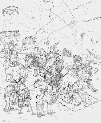
Here are the sketches from my latest What's Wrong? illustration created for November's Highlights.
As you can see the first one is a bit too crowded, there aren't enough average sized telescopes and there isn't enough sky showing.
The second is less crowded. The only problem is a few "wrongs" aren't obvious enough.
The "wrongs" are not a bit easier to read but more children are needed.
The final sketch.


No comments:
Post a Comment