

Back in July I was asked to create the above mural for the Highlights Illustrators' Party. A big honor. The theme was based on Highlights High Five's "That's Silly!" feature, a variation of the Highlights' "What's Wrong?" feature that is found on the back covers of which I have been doing a lot of the past year.
Since blogger will not allow you to get a closer look at this image I have split and uploaded the mural as close up segments below. A detailed description of how I went about making this piece is below the last segment.


A lot of people have asked me how I did this piece so I will do my best to explain this process without boring you with too many details.
Right away we knew we wanted the Highlights building to be the central feature of the piece so I started on some loose sketches using photos I had taken myself and some that I had found on Google Maps' street view. I also did some brainstorming by writing down some silly ideas.

Once I had a rough sketch of the scene chosen I enlarged it and made these rough sketches on top to flesh out the ideas for the silly situations (some I made up and some were suggested by the staff of Highlights). All four season were to be represented in the illustration which was hard to pull off. Winter and fall were easily recognizable but how does one differentiate between summer and spring?

Once I had some ideas down I did more research and sketched out the building with the characters to be added later. I always consider the background just as important as the characters so I take the extra time to make sure it has enough character to stand on its own. I also didn't use any vanishing points since using them often makes the drawing stale and kind of phony looking. I just eyed it up as best as I could. All of this was done by hand on a 24" wide piece of paper.

As you can see above I only drew 2 windows and a few of the small pillars but after it was scanned I duplicated them and carefully put them in position using Photoshop's distort transformation tools. I also separately sketched some elements to the right and left of the building to fill the 40" width as seen below. I had to keep in mind that when printed it would be 13 x 40 feet so I worked with the ratio of 1 inch = 1 foot. Some of the drawing was also done using my wacom tablet.

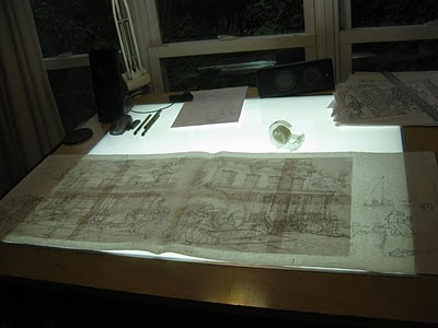
After the building was completely sketched, I tile printed it and taped it together. Now it was time to add the characters. I placed two sheets of 24" layout on top and went to work. It went form one side of my art table to the other.

After the characters were finished I scanned them in and used Photoshop to place them in the scene. I think there were some 40 layers at 175 MB before I flattened it.

At this point the file was sent to the Highlights' Art Director, Cindy. A week or so later corrections were sent so I quickly revised the sketch as seen below. A big benefit to having all of your characters on separate layers is that if something needs to move, be removed, or replaced it is fairly easy to do. The windsurfer was removed and replaced with the cabin among other things.

Now it was time for inking. Usually I ink all of my work by hand and scan it in but once I started I realized that all of my small details were getting entirely too fudgy. Since this piece was going to be enlarged I knew that all of the flaws in my inking would be magnified so I decided to ink with my wacom tablet in Photoshop using the brush tool. That way I could get up close and personal with the line and really have control over the small minute details (click on the 100% view below). I'm not a big fan of the artificial smoothness of the pen tool so I stuck with the brush tool. Thanks to the suggestion of a few illustrators I inked at a higher than normal resolution of 600dpi.

It definitely took some getting used too and I really damaged my hand inking it over the next few days (a price I'm still paying for). Once done the entire piece was inked in one 13x40" file. I inked only two windows, one small pillar, and duplicated them here as well.

After the inking was completed I reduced the file to the standard 300dpi resolution and got to work on the colors (click on the 100% view below). I start off with point-and-click paint bucket coloring first and move onto textures later. I have designed and/or downloaded some of brushes over the years to use for texturing.

UPDATE: I forgot to thank my wife, Daisy, for pulling some single Mom duty to give me the time to finish the coloring. Toward the end there, I was working 18 hour days in order to have this done on time.

That same day it was sent off to the printer and enlarged into this billboard sized mural. After being delivered those brilliantly handy guys at Highlights built a frame so it could be to be placed in the local firehall for the party. Here is a photo of it before the party.

Tim was nice enough to let us see it before the party so I could get a few photos with my family. I can't put into words how cool it was to see my art so large.


Thanks to everyone that made the decision to honor me with this crazy project. I hope I get to do something this fun again. Thank you, thank you, thank you.
All images are Copyright © Highlights for Children 2010.
5 comments:
Thank YOU! I would be ever so proud of this too. You did a great job, Chuck! Thanks for sharing the process!
You are awesome sir! Amazingly, incredibly, awesome!
Awesome! I love this a lot!
BTW I got your Which Art Student Are You? book in the mail. Thanks for signing it and the little Usagi head sketch on the mailer.
Unfortunately the mail person shoved it in my mailbox, bending it and crushing the spine. Still the art inside is unharmed :) and I look forward to sitting down and reading it when I get some down time. Thanks again!
Peace, maka
Thanks, everyone!
I'm sorry to hear that Maka. Those Postal Workers can be such clods sometimes. Last week I had to teach one how to find a zip code. You would think that was lesson one. Good grief!
Hey Chuck:
I hate to be a critic, but I was taking a close look at your drawing and it has a lot of things that do not make sense.....its kind of like drawing a cartoon character without pants...
Post a Comment